Category Archives: plotting

Reading and writing Excel (xls) files with Incanter

I have just added David James Humphreys’ incanter-excel module to the Incanter distribution, providing basic capabilities for reading Microsoft Excel spreadsheets in as Incanter datasets and saving datasets back out as xls files.

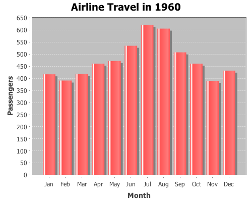
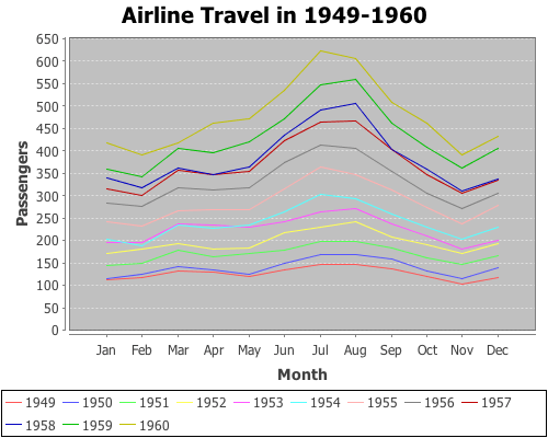
I have posted a simple spreadsheet of Australian airline passenger data from the 1950s to the Incanter website for the following example. The read-xls function can read xls files given either a filename or URL, so you won’t need to download the file.

Start by loading the necessary libraries, including incanter.excel.

(use '(incanter core charts excel))

Next, we can use the with-data macro to bind a dataset converted from the above xls file, using the read-xls function, and then view it.

(with-data (read-xls "http://incanter.org/data/aus-airline-passengers.xls")
  (view $data)

The read-xls function takes an optional argument called :sheet that takes either the name or index of the worksheet from the xls file to read (in this case either “dataset” or 0) , it defaults to 0.

[NOTE: A current weakness of read-xls is that cells containing formulae, as opposed to actual data, are not imported (i.e. the cells remain empty).]

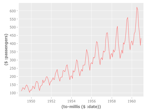
Finally, we’ll create a time-series plot of the data. However, the time-series-plot needs time in milliseconds, so we’ll first create a function that converts the date column from Java Date objects to milliseconds, and then view the plot.

  (let [to-millis (fn [dates] (map #(.getTime %) dates))] 
    (view (time-series-plot (to-millis ($ :date)) ($ :passengers)))))

Datasets can also be saved as Excel files using the save-xls function. The following example just reads in one of the sample datasets using incanter.datasets/get-dataset and then saves it as an xls file.

(save-xls (get-dataset :cars) "/tmp/cars.xls")

The incanter-excel module is now included in the Incanter distribution on Github, and is available as a separate dependency from the Clojars repository. The complete code from this example can be found here.

New default theme and customization features for Incanter charts

I just updated Incanter‘s default chart theme. The new theme is inspired by Hadley Wickham‘s awesome ggplot2 package for R.

The first example is my usual “hello world” chart, a histogram of data sampled from a normal distribution.

(use '(incanter core charts stats datasets))

(view (histogram (sample-normal 1000)))

The next example is a scatter plot of the sepal-length vs. sepal-width from the built-in iris data set.

(view (scatter-plot :Sepal.Length :Sepal.Width :data (get-dataset :iris)))

In addition to changing the default theme, I have included new functions for customizing the appearance of the charts. Here’s an example of the set-stroke function, used here to change the color of the data points in the previous chart.

(doto (scatter-plot :Sepal.Length :Sepal.Width :data (get-dataset :iris))
  (set-stroke-color java.awt.Color/gray)
  view)

The next example uses the :group-by option to color the points based on their species.

(view (scatter-plot :Sepal.Length :Sepal.Width 
                    :group-by :Species 
                    :data (get-dataset :iris)))

This example uses function-plot to create an xy-plot of the sine and cosine functions.

(doto (function-plot sin -10 10)
  (add-function cos -10 10)
  view)

This example uses the $rollup and bar-chart functions to plot the data from the built-in hair-eye-color data set.

(with-data (->>  (get-dataset :hair-eye-color)
             ($rollup :sum :count [:hair :eye]))
  (view (bar-chart :hair :count :group-by :eye :legend true)))

This example uses the box-plot function to plot data from three gamma distributions.

(doto (box-plot (sample-gamma 1000 :shape 1 :rate 2)
                :legend true :y-label "")
  view 
  (add-box-plot (sample-gamma 1000 :shape 2 :rate 2))
  (add-box-plot (sample-gamma 1000 :shape 3 :rate 2)))

The following examples are based on the charts in figure 4.2 of chapter four of “The Joy of Clojure“, where the performance characteristics of Clojure’s data structures are discussed.

First define the two functions to plot, and the range of values to plot them over.

(defn log32 [x] (/ (log x) (log 32)))
(defn f1 [n] (plus (log2 n) (mult (log32 n) 5000)))
(defn f2 [n] n)

(def min-val 10)
(def max-val 40000)

Next, create the plot and use the set-stroke function to increase the stroke thickness for both lines, and make the second line dashed.

(def chart (doto (function-plot f1 min-val max-val 
                   :legend true 
                   :series-label "O(log2 n) + O(log32 n) * 5000"
                   :x-label ""
                   :y-label "")
             (add-function f2 min-val max-val 
                           :step-size 5000 
                           :series-label "O(n)") 
             (set-stroke :width 2)
             (set-stroke :width 2 :dataset 1 :dash 5)))

(view chart)

The three charts in the book are of the same data but each focuses on a different region. You can use the set-y-range and set-x-range functions to zoom-in on each of the different regions.

;; PLOT (A)
(doto chart
  (set-title "(A)")
  (set-x-range 100 5000)
  (set-y-range 30 12000))

;; PLOT (B)
(doto chart
  (set-title "(B)")
  (set-y-range 10000 16000)
  (set-x-range 10000 16000))

;; PLOT (C)
(doto chart
  (set-title "(C)")
  (set-y-range 0 30000)
  (set-x-range 0 30000))

The new theme is available in the latest version of Incanter on Clojars and Github, and the complete code for the above examples is available here.

Incanter blog post roundup

There have been several cool blog posts over the last few weeks featuring Incanter that I would like to highlight here.

Data Sorcery with Clojure & Incanter: Introduction to Datasets & Charts

I put together my slides (pdf) for next week’s National Capital Area Clojure Users Group February Meetup. Being snow-bound this week, I’ve been able to make more slides than I’ll have time to cover during next week’s session, so I’ll be skimming over some of the examples.

Russ Olsen will start the session with an introduction to Clojure, so if you’re in the D.C. area next Thursday (February 18), sign-up for the meetup.

The code used in this presentation is available here, and a more printer-friendly version of the presentation itself, with a white background, is available here.

Creating Processing Visualizations with Clojure and Incanter

The Processing language, created by Ben Fry and Casey Reas,
“is an open source programming language and environment for people who want to program images, animation, and interactions.”

Incanter now includes the incanter.processing library, a fork of Roland Sadowski‘s clj-processing library, making it possible to create Processing visualizations with Clojure and Incanter. Incanter.processing provides much more flexibility when creating customized data visualizations than incanter.charts — of course, it is also more complex to use.

Several nice examples of the kinds of visualizations that can be created in Processing can be found on Ben Fry’s website and blog, including the cool zipcode, human vs. chimps, baseball salary vs. performance examples.

The processing website has a set of tutorials, including one on getting started, and there are also three great books on Processing worth checking out:

The API documentation for incanter.processing is still a bit underdeveloped, but is perhaps adequate when combined with the excellent API reference on the Processing website.

Incanter.processing was forked from of Roland Sadowski’s clj-processing library in order to provide cleaner integration with Incanter. I have added a few functions, eliminated some, and changed the names of others. There were a few instances where I merged multiple functions (e.g. *-float, *-int) into a single one to more closely mimic the original Processing API; I incorporated a couple functions into Incanter’s existing multi-methods (e.g. save and view); I eliminated a few functions that duplicated existing Incanter functions and caused naming conflicts (e.g. sin, cos, tan, asin, acos, atan, etc); and I changed the function signatures of pretty much every function in clj-processing to require the explicit passing of the ‘sketch’ (PApplet) object, whereas the original library passes it implicitly by requiring that it is bound to a variable called *applet* in each method of the PApplet proxy.

These changes make it easier to use Processing within Incanter, but if you just want to write Processing applications in Clojure without all the dependencies of Incanter, then the original clj-processing library is the best choice.

A Simple Example

The following is sort of a “hello world” example that demonstrates the basics of creating an interactive Processing visualization (a.k.a sketch), including defining the sketch’s setup, draw, and mouseMoved methods and representing state in the sketch using closures and refs. This example is based on this one, found at John Resig‘s Processing-js website.


Click on the image above to see the live Processing-js version of the sketch.

Start by loading the incanter.core and incanter.processing libraries,

(use '(incanter core processing))

Now define some refs that will represent the state of the sketch object,

(let [radius (ref 50.0)
      X (ref nil)
      Y (ref nil)
      nX (ref nil)
      nY (ref nil)
      delay 16

The variable radius will provide the value of the circle’s radius; X and Y will indicate the location of the circle; and nX and nY will indicate the location of the mouse. We use refs for these values because their values are mutable and need to be available across multiple functions in the sketch object.

Now define a sketch object, which is just a proxied processing.core.PApplet, and its required setup method,

sktch (sketch
        (setup []
          (doto this
            (size 200 200)
            (stroke-weight 10)
            (framerate 15)
            smooth)
          (dosync
            (ref-set X (/ (width this) 2))
            (ref-set Y (/ (width this) 2))
            (ref-set nX @X)
            (ref-set nY @Y)))

The first part of the setup method sets the size of the sketch, the stroke weight to be used when drawing, the framerate of the animation, and indicates that anti-aliasing should be used. The next part of the method uses a dosync block and ref-set to set initial values for the refs. Note the @ syntax to dereference (access the values of) the refs X and Y.

Processing sketches that use animation require the definition of a draw method, which in this case will be invoked 15 times per second as specified by the framerate.

  (draw []
   (dosync
     (ref-set radius (+ @radius 
                        (sin (/ (frame-count this) 4))))
     (ref-set X (+ @X (/ (- @nX @X) delay)))
     (ref-set Y (+ @Y (/ (- @nY @Y) delay))))
   (doto this
     (background 125) ;; gray
     (fill 0 121 184)
     (stroke 255)
     (ellipse @X @Y @radius @radius)))

The first part of the draw method uses dosync and ref-set to set new values for the radius, X, and Y refs for each frame of the animation. The sin function is used to grow and shrink the radius over time. The location of the circle, as indicated by X and Y, is determined by the mouse location (nX and nY) with a delay factor.

The next part of the draw method draws the background (i.e. gray background) and the circle with the ellipse function.

Finally, we need to define the mouseMoved method in order to track the mouse location, using the mouse-x and mouse-y functions, and set the values of the nX and nY refs. All event functions in incanter.processing, including mouseMoved, require an event argument; this is due to limitations of Clojure’s proxy macro, and isn’t required when using the Processing’s Java API directly.

(mouseMoved [mouse-event]
  (dosync
    (ref-set nX (mouse-x mouse-event)) 
    (ref-set nY (mouse-y mouse-event)))))]

Now that the sketch is fully defined, use the view function to display it,

(view sktch :size [200 200]))

The complete code for this example can be found here.

In future posts I will walk through other examples of Processing visualizations, some of which can be found in the Incanter distribution under incanter/examples/processing.

Plotting with non-numeric data

Yesterday, I received a question about plotting with non-numeric data. Unfortunately, the only way to do it in Incanter was to convert the data to numeric values, usually using the to-matrix function. So I have added two new functions, bar-chart and line-chart, that accept non-numeric data. In order to reduce the likelihood of confusing the line-plot function with the line-chart function, I renamed line-plot to xy-plot (which better reflects the name of the underlying JFreeChart class). The following are some examples of using these functions (for other plotting examples, see the sample plots and probability distributions pages of the Incanter wiki).

First, load the necessary libraries.

(use '(incanter core charts datasets))

Now plot a simple bar-chart. The first argument is a vector of categories, the second is a vector of values associated with each category.

(view (bar-chart ["a" "b" "c" "d" "e"] 
                 [10 20 30 25 20]))

Use the :group-by option to associate multiple bars with each category.

(view (bar-chart ["a" "a" "b" "b" "c" "c" ] 
                 [10 20 30 10 40 20]
                 :legend true 
                 :group-by ["I" "II" "I" "II" "I" "II"]))

Line-charts behave just like bar-charts.

(view (line-chart ["a" "b" "c" "d" "e"] 
                  [20 10 30 25 40]))

The following examples use data on the number of airline passengers from 1949 through 1960. First load the sample data using the get-dataset function.

(def data (get-dataset :airline-passengers))

Now group the data by year, and plot just the last year (1960),

(def by-year (group-by data 0))
(view (bar-chart (sel (last by-year) :cols 2) 
                 (sel (last by-year) :cols 1)
                 :title "Airline Travel in 1960"
                 :y-label "Passengers"
                 :x-label "Month"))

and view the same data with a line-chart.

(view (line-chart (sel (last by-year) :cols 2) 
                 (sel (last by-year) :cols 1)
                 :title "Airline Travel in 1960"
                 :y-label "Passengers"
                 :x-label "Month"))

Now use the :group-by option in line-chart to view the data for each year,

(view (line-chart (sel data :cols 2) 
                 (sel data :cols 1)
                 :group-by (sel data :cols 0)
                 :title "Airline Travel in 1949-1960"
                 :legend true
                 :y-label "Passengers"
                 :x-label "Month"))

and do the same with a bar-chart.

(view (bar-chart (sel data :cols 2) 
                 (sel data :cols 1)
                 :group-by (sel data :cols 0)
                 :title "Airline Travel in 1949-1960"
                 :legend true
                 :y-label "Passengers"
                 :x-label "Year"))

Instead of grouping by year, we can group-by month.

(view (bar-chart (sel data :cols 0) 
                 (sel data :cols 1)
                 :group-by (sel data :cols 2)
                 :title "Airline Travel in 1949-1960"
                 :legend true
                 :y-label "Passengers"
                 :x-label "Year")
       :width 525)

The complete code for these examples can be found here.

Annotating Incanter plots

The following examples will demonstrate how to annotate Incanter plots using the add-pointer, add-text, and add-polygon functions. You will need the incanter.core, incanter.stats, incanter.charts, and incanter.datasets libraries. For more information on using these libraries, see the matrices, datasets, and sample plots pages on the Incanter wiki.

Start by loading the necessary libraries,

(use '(incanter core stats charts datasets))

and plotting the sin function using the function-plot function.

(def plot (function-plot sin (* -2 Math/PI) (* 2 Math/PI)))
(view plot)

Now annotate a few points on the plot with the add-pointer function.

(doto plot
  (add-pointer (- Math/PI) (sin (- Math/PI)) 
               :text "(-pi, (sin -pi))")
  (add-pointer Math/PI (sin Math/PI) 
               :text "(pi, (sin pi))" :angle :ne)
  (add-pointer (* 1/2 Math/PI) (sin (* 1/2 Math/PI)) 
               :text "(pi/2, (sin pi/2))" :angle :south))

add-pointer’s :angle option changes the direction the arrow is pointing. A number representing the angle, or a keyword representing a direction can be passed as arguments.

Here’s an example of each of the directions.

(doto plot
  (add-pointer 0 0 :text "north" :angle :north)
  (add-pointer 0 0 :text "nw" :angle :nw)
  (add-pointer 0 0 :text "ne" :angle :ne)
  (add-pointer 0 0 :text "west" :angle :west)
  (add-pointer 0 0 :text "east" :angle :east)
  (add-pointer 0 0 :text "south" :angle :south)
  (add-pointer 0 0 :text "sw" :angle :sw)
  (add-pointer 0 0 :text "se" :angle :se))

This next example will demonstrate using the add-text and add-polygon functions by annotating the iris PCA scatter-plot generated in an earlier post. The code for creating this plot can be found here.

Now add the species names to each cluster.

(doto plot
  (add-text -2.5 -6.5 "Setosa")
  (add-text -5 -5.5 "Versicolor") 
  (add-text -8 -5.5 "Virginica"))

The text is centered at the given coordinates. Finally place a box around the Setosa group.

(add-polygon plot 
  [[-3.2 -6.3] [-2 -6.3] [-2 -3.78] [-3.2 -3.78]])

Shapes are not limited to rectangles, add as many coordinates as necessary to create arbitrary polygons; the last point will automatically connect to the first one. If only two coordinates are provided a single line is added to the plot.

Incanter charts are instances of the JFreeChart class from the JFreeChart library, so additional customizations can be achieved by using the underlying Java APIs directly.

The complete code for this example can be found here.