
I just updated Incanter‘s default chart theme. The new theme is inspired by Hadley Wickham‘s awesome ggplot2 package for R.
The first example is my usual “hello world” chart, a histogram of data sampled from a normal distribution.
(use '(incanter core charts stats datasets))

(view (histogram (sample-normal 1000)))

The next example is a scatter plot of the sepal-length vs. sepal-width from the built-in iris data set.
(view (scatter-plot :Sepal.Length :Sepal.Width :data (get-dataset :iris)))

In addition to changing the default theme, I have included new functions for customizing the appearance of the charts. Here’s an example of the set-stroke function, used here to change the color of the data points in the previous chart.
(doto (scatter-plot :Sepal.Length :Sepal.Width :data (get-dataset :iris))
  (set-stroke-color java.awt.Color/gray)
  view)

The next example uses the :group-by option to color the points based on their species.
(view (scatter-plot :Sepal.Length :Sepal.Width
                    :group-by :Species
                    :data (get-dataset :iris)))

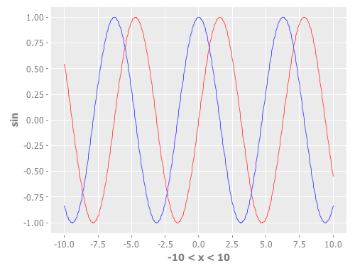
This example uses function-plot to create an xy-plot of the sine and cosine functions.
(doto (function-plot sin -10 10)
  (add-function cos -10 10)
  view)
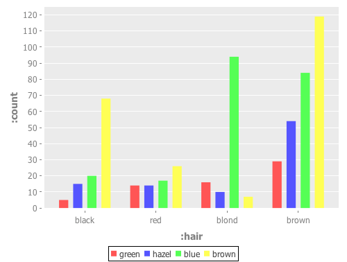
This example uses the $rollup and bar-chart functions to plot the data from the built-in hair-eye-color data set.
(with-data (->>  (get-dataset :hair-eye-color)
             ($rollup :sum :count [:hair :eye]))
  (view (bar-chart :hair :count :group-by :eye :legend true)))
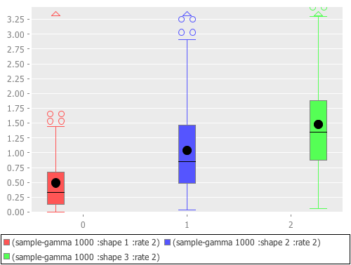
This example uses the box-plot function to plot data from three gamma distributions.
(doto (box-plot (sample-gamma 1000 :shape 1 :rate 2)
                :legend true :y-label "")
  view
  (add-box-plot (sample-gamma 1000 :shape 2 :rate 2))
  (add-box-plot (sample-gamma 1000 :shape 3 :rate 2)))
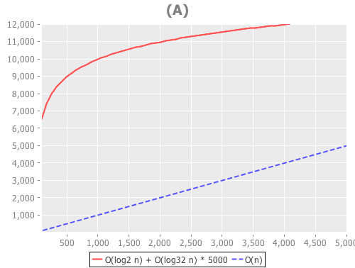
The following examples are based on the charts in figure 4.2 of chapter four of “The Joy of Clojure“, where the performance characteristics of Clojure’s data structures are discussed.
First define the two functions to plot, and the range of values to plot them over.
(defn log32 [x] (/ (log x) (log 32)))
(defn f1 [n] (plus (log2 n) (mult (log32 n) 5000)))
(defn f2 [n] n)

(def min-val 10)
(def max-val 40000)
Next, create the plot and use the set-stroke function to increase the stroke thickness for both lines, and make the second line dashed.
(def chart (doto (function-plot f1 min-val max-val
                   :legend true
                   :series-label "O(log2 n) + O(log32 n) * 5000"
                   :x-label ""
                   :y-label "")
             (add-function f2 min-val max-val
                           :step-size 5000
                           :series-label "O(n)")
             (set-stroke :width 2)
             (set-stroke :width 2 :dataset 1 :dash 5)))

(view chart)
The three charts in the book are of the same data but each focuses on a different region. You can use the set-y-range and set-x-range functions to zoom-in on each of the different regions.
;; PLOT (A)
(doto chart
  (set-title "(A)")
  (set-x-range 100 5000)
  (set-y-range 30 12000))
;; PLOT (B)
(doto chart
  (set-title "(B)")
  (set-y-range 10000 16000)
  (set-x-range 10000 16000))

;; PLOT (C)
(doto chart
  (set-title "(C)")
  (set-y-range 0 30000)
  (set-x-range 0 30000))

The new theme is available in the latest version of Incanter on Clojars and Github, and the complete code for the above examples is available here.

Looks great! This will make Incanter a goto for quick visualizations.
This is a serious improvement in aesthetics over the old defaults; it has many fewer distractions from the data. Nice work!
I also appreciate the examples of how to use the graphing facilities, which compose a nice complement to your slides introducing the basics of Incanter.
I plan to take full advantage of this in the book. :-)
:m
That’s awesome, let me know if I can help :-)
Can histograms be colored? I’m trying to plot two histograms, in different colors with the bars from the two series of data side-by-side in the same bin. Not sure if that description make sense…
I used to copy-paste data to a spreadsheet to make the histogram but hoping to do this from Clojure now…
hmm… kinda like the bar-chart function with the group-by, except I’m hoping I don’t have to write the code to do the binning and stuff myself…
Thanks lots!!!