
Yesterday, I received a question about plotting with non-numeric data. Unfortunately, the only way to do it in Incanter was to convert the data to numeric values, usually using the to-matrix function. So I have added two new functions, bar-chart and line-chart, that accept non-numeric data. In order to reduce the likelihood of confusing the line-plot function with the line-chart function, I renamed line-plot to xy-plot (which better reflects the name of the underlying JFreeChart class). The following are some examples of using these functions (for other plotting examples, see the sample plots and probability distributions pages of the Incanter wiki).
First, load the necessary libraries.
(use '(incanter core charts datasets))Now plot a simple bar-chart. The first argument is a vector of categories, the second is a vector of values associated with each category.
(view (bar-chart ["a" "b" "c" "d" "e"]
                 [10 20 30 25 20]))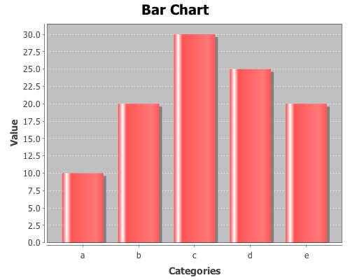
Use the :group-by option to associate multiple bars with each category.
(view (bar-chart ["a" "a" "b" "b" "c" "c" ]
                 [10 20 30 10 40 20]
                 :legend true
                 :group-by ["I" "II" "I" "II" "I" "II"]))
Line-charts behave just like bar-charts.
(view (line-chart ["a" "b" "c" "d" "e"]
                  [20 10 30 25 40]))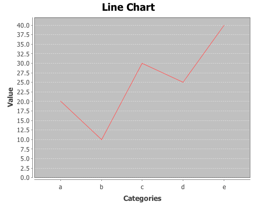
The following examples use data on the number of airline passengers from 1949 through 1960. First load the sample data using the get-dataset function.
(def data (get-dataset :airline-passengers))Now group the data by year, and plot just the last year (1960),
(def by-year (group-by data 0))(view (bar-chart (sel (last by-year) :cols 2)
(sel (last by-year) :cols 1)
:title "Airline Travel in 1960"
:y-label "Passengers"
:x-label "Month"))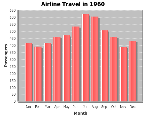
and view the same data with a line-chart.
(view (line-chart (sel (last by-year) :cols 2)
                 (sel (last by-year) :cols 1)
                 :title "Airline Travel in 1960"
                 :y-label "Passengers"
                 :x-label "Month"))
Now use the :group-by option in line-chart to view the data for each year,
(view (line-chart (sel data :cols 2)
                 (sel data :cols 1)
                 :group-by (sel data :cols 0)
                 :title "Airline Travel in 1949-1960"
                 :legend true
                 :y-label "Passengers"
                 :x-label "Month"))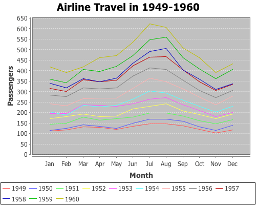
and do the same with a bar-chart.
(view (bar-chart (sel data :cols 2)
                 (sel data :cols 1)
                 :group-by (sel data :cols 0)
                 :title "Airline Travel in 1949-1960"
                 :legend true
                 :y-label "Passengers"
                 :x-label "Year"))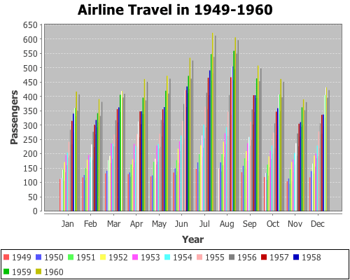
Instead of grouping by year, we can group-by month.
(view (bar-chart (sel data :cols 0)
                 (sel data :cols 1)
                 :group-by (sel data :cols 2)
                 :title "Airline Travel in 1949-1960"
                 :legend true
                 :y-label "Passengers"
                 :x-label "Year")
       :width 525)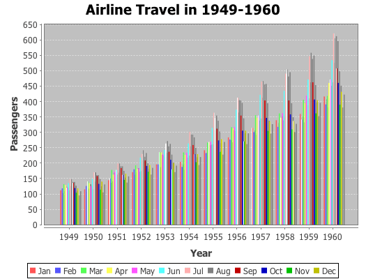
The complete code for these examples can be found here.

Hello David,
my congratulations for the excellent package incanter. Using xy-plot I have noticed that independent variable is probably(?) sorted before plotting. That is the reason why phase plots look litle bit strange. Below is the code:
(let [a (map (fn [x] (sin x)) (range 0 (* Math/PI 2) 0.1))
b (map (fn [x] (cos x)) (range 0 (* Math/PI 2) 0.1))]
(view (xy-plot a b)))
My best wishes for the New Year.
Wojtek
PS. Do you plan to include some ODE solvers in you package. It will be even more useful (my point of view)