Category Archives: Clojure

Significance testing with randomization

We can use randomization (a.k.a. permutation tests) for significance testing by comparing a statistic calculated from a sample with the distribution of statistics calculated from samples where the null hypothesis is true.

In an earlier post, I demonstrated how to perform a t-test in Incanter. The p-value calculated for the test is based on the assumption that the distribution of test statistics when the null hypothesis, that the two sample means are identical, is true is a t-distribution. Let’s see if that assumption appears correct by generating 1000 samples of data where the null hypothesis is true, calculating the t-statistic for each, and then examining the distribution of statistics.

We can then compare the original t-statistic with this distribution and determine the probability of seeing that particular value when the null hypothesis is true. If the probability is below some cutoff (typically, 0.05) we reject the null hypothesis.

Start by loading the necessary libraries:

(use '(incanter core stats datasets charts))

Load the plant-growth data set.

(def data (to-matrix (get-dataset :plant-growth)))

Break the first column of the data into groups based on treatment type (second column) using the group-by function,

(def groups (group-by data 1 :cols 0))

The first group is the the control, the other two are treatments. View box-plots of the three groups, using the :group-by option of the box-plot function,

(view (box-plot (sel plant-growth :cols 0) 
                :group-by (sel plant-growth :cols 1)))

and then view the means of the three groups

(map mean groups)

This returns (5.032 4.661 5.526). So, the question is, are these means statistically different from each other?

Run the t-tests comparing the means of the first and second treatment groups with the control,

(def t1 (t-test (first groups) :y (second groups)))
(def t2 (t-test (first groups) :y (last groups)))

and view the test statistic and p-value for the first treatment,

(:t-stat t1)
(:p-value t1)

which are 1.191 and 0.2503, respectively, and the second treatment,

(:t-stat t2)
(:p-value t2)

which are -2.134 and 0.0479, respectively. These values provide evidence that the first treatment is not statistically significantly different from the control, but the second treatment is.

The above p-values are based on the assumption that the distribution of t-test statistics, when the null hypothesis is true, is a t-distribution. Let’s see if that assumption appears correct for these samples by generating 1000 samples where the null hypothesis is true. We can do that by permuting values between each of the treatments and the control using the sample-permutations function.


(def perm-groups1 (sample-permutations 1000 
                                       (first groups) 
                                       (second groups)))

(def perm-groups2 (sample-permutations 1000 
                                       (first groups) 
                                       (last groups)))

Now create a function, based on t-test, that takes two sequence and returns just the :t-stat value

(defn t-stat [x y] (:t-stat (t-test x :y y)))

Calculate the t-test statistics for each of the permuted versions of the two treatments and control with the map function.

(def t-stats1 (map t-stat 
                  (first perm-groups1) 
                  (second perm-groups1)))

(def t-stats2 (map t-stat 
                  (first perm-groups2) 
                  (second perm-groups2)))

Now plot the distribution of the t-test statistics, and overlay the pdf of a t-distribution for the for the first treatment.

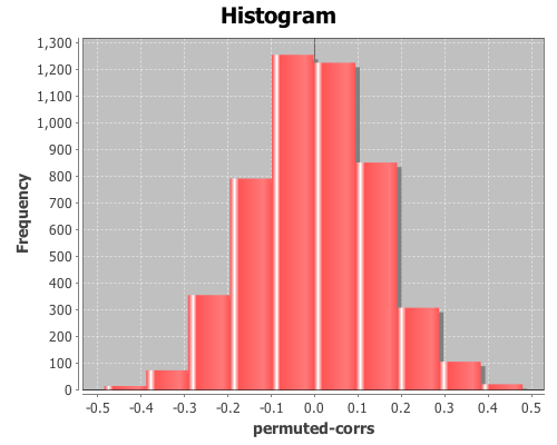
(doto (histogram t-stats1 :density true :nbins 20)
      (add-function #(pdf-t % :df (:df t1)) -3 3)
      view)

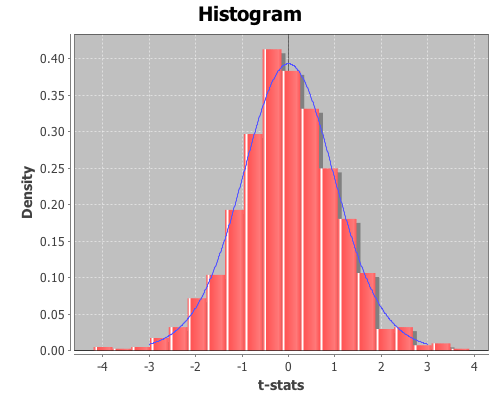
The distribution looks like a Student’s t. Now inspect the mean, standard deviation, and 95% confidence interval for the distribution from the first treatment.

(mean t-stats1)

The mean is 0.023,

(sd t-stats1)

the standard deviation is 1.064,

(quantile t-stats1 :probs [0.025 0.975])

and the 95% confidence interval is (-2.116 2.002). Since the t-statistics for the original sample, 1.191, falls within the range of the confidence interval, we cannot reject the null hypothesis; the mean of the first treatment and the control are statistically indistinguishable.

Now view their mean, sd, and 95% confidence interval for the second treatment,

(mean t-stats2)

The mean is -0.014,

(sd t-stats2)

The standard deviation is 1.054,

(quantile t-stats2 :probs [0.025 0.975])

and the 95% confidence interval is (-2.075 2.122). In this case, the original t-statistic, -2.134, is outside of the confidence interval, therefore the null hypothesis should be rejected; the second treatment is statistically significantly different than the control.

In both cases the permutation tests agreed with the standard t-test p-values. However, permutation tests can be used to test significance on sample statistics that do not have well known distributions like the t-distribution.

Comparing means without the t-statistic

Using a permutation test, we can compare means without using the t-statistic at all. First, define a function to calculate the difference in means between two sequences.


(defn means-diff [x y] 
  (minus (mean x) (mean y)))

Calculate the difference in sample means between the first treatment and the control.


(def samp-mean-diff (means-diff (first groups) 
                                (second groups))) 

This returns 0.371. Now calculate the difference of means of the 1000 permuted samples by mapping the means-diff function over the rows returned by the sample-permutations function we ran earlier.


(def perm-means-diffs1 (map means-diff 
                            (first perm-groups1) 
                            (second perm-groups1)))

This returns a sequence of differences in the means of the two groups.

Plot a histogram of the perm-means-diffs1 using the density option, instead of the default frequency, and then add a pdf-normal curve with the mean and sd of perm-means-diffs data for a visual comparison.


(doto (histogram perm-means-diffs1 :density true)
      (add-lines (range -1 1 0.01) 
                 (pdf-normal (range -1 1 0.01) 
                             :mean (mean perm-means-diffs1) 
                             :sd (sd perm-means-diffs1)))
      view)

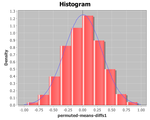
The permuted data looks normal. Now calculate the proportion of values that are greater than the original sample means-difference. Use the indicator function to generate a sequence of ones and zeros, where one indicates a value of the perm-means-diff sequence is greater than the original sample mean, and zero indicates a value that is less.

Then take the mean of this sequence, which gives the proportion of times that a value from the permuted sequences are more extreme than the original sample mean (i.e. the p-value).

(mean (indicator #(> % samp-mean-diff) 
                 perm-means-diffs1))

This returns 0.088, therefore the calculated p-value is 0.088, meaning that 8.8% of the permuted sequences had a difference in means at least as large as the difference in the original sample means. Therefore there is no evidence (at an alpha level of 0.05) that the means of the control and treatment-one are statistically significantly different.

We can also test the significance by computing a 95% confidence interval for the permuted differences. If the original sample means-difference is outside of this range, there is evidence that the two means are statistically significantly different.

(quantile perm-means-diffs1 :probs [0.025 0.975]) 

This returns (-0.606 0.595), but since the original sample mean difference was 0.371, which is inside the interval, this is further evidence that treatment one’s mean is not statistically significantly different than the control.

Now, calculate the p-values for the difference in means between the control and treatment two.


(def perm-means-diffs2 (map means-diff 
                            (first perm-groups2) 
                            (second perm-groups2)))

(def samp-mean-diff (means-diff (first groups) 
                                (last groups)))

(mean (indicator #(< % samp-mean-diff) 
                 perm-means-diffs2))

(quantile perm-means-diffs2 
          :probs [0.025 0.975])

The calculated p-value is 0.022, meaning that only 2.2% of the permuted sequences had a difference in means at least as large as the difference in the original sample means. Therefore there is evidence (at an alpha level of 0.05) that the means of the control and treatment-two are statistically significantly different.

The original sample mean difference between the control and treatment two was -0.4939, which is outside the range (-0.478 0.466) calculated above. This is further evidence that treatment two’s mean is statistically significantly different than the control.

The complete code for this example is here.

Further Reading

Chi-Square Test of Independence

This example will demonstrate the use of the chisq-test function to perform tests of independence on a couple sample data sets.

The first data set shows the number of male and female students with each of 16 different combinations of hair and eye color. We will use this data sample to test whether there is an association between hair and eye color. We will test males and females separately.

First load the necessary libraries.

(use '(incanter core stats charts datasets))

Now load the sample data with the get-dataset function, and then use group-by to break the data set into two groups based on gender (third column).

(def by-gender (group-by (get-dataset :hair-eye-color) 2))

Now take a look at the data for the males,

(def male-data (first by-gender))
(view male-data)

and the females.

(def female-data (second by-gender))
(view female-data)

Extract the hair color, eye color, and count values from the data set, defining three new variables.

(def m-hair (sel male-data :cols 0))
(def m-eye (sel male-data :cols 1))
(def m-count (sel male-data :cols 3))

Now use the bar-chart function to show the distribution of hair and eye color for males,

(view (bar-chart m-hair m-count 
                 :group-by m-eye 
                 :legend true 
                 :title "Male Hair and Eye Color"
                 :x-label "Hair Color"        
                 :y-label "Number of males"))

and for the females.

(def f-hair (sel female-data :cols 0))
(def f-eye (sel female-data :cols 1))
(def f-count (sel female-data :cols 3))
(view (bar-chart f-hair f-count 
                 :group-by f-eye 
                 :legend true 
                 :title "Female Hair and Eye Color"
                 :x-label "Hair Color"        
                 :y-label "Number of females"))

We can reshape the two vectors of 16 count values (male and female) into two 4×4 contingency tables using the matrix function.

(def m-table (matrix m-count 4))
(def f-table (matrix f-count 4))

Here are the two new contingency tables.

> m-table
[36.0000  9.0000  5.0000  2.0000
 66.0000 34.0000 29.0000 14.0000
 16.0000  7.0000  7.0000  7.0000
 4.0000 64.0000  5.0000  8.0000]

> f-table
[32.0000 11.0000 10.0000  3.0000
 53.0000 50.0000 25.0000 15.0000
 10.0000 10.0000  7.0000  7.0000
 3.0000 30.0000  5.0000  8.0000]

Now run the chisq-test function on the two tables,

(def m-test (chisq-test :table m-table))
(def f-test (chisq-test :table f-table))

and view the X-sq test statistics, the degrees of freedom, and the p-value for the test for males,

(:X-sq m-test) ;; 106.66
(:p-value m-test) ;; 7.01E-19
(:df m-test) ;; 9

and females.

(:X-sq f-test) ;; 41.28
(:p-value f-test) ;; 4.45E-6
(:df f-test) ;; 9

Both p-values are considerable below a 0.05 cut off threshold, indicating that the null hypothesis, that there is no association between eye and hair color, should be rejected for both males and females.

In addition to passing contingency tables as arguments to chisq-test, you can pass raw data using the :x and :y arguments, which we will do in the following example.

This example will test whether there is any correlation between the pass/fail results of a high school mathematics proficiency test and a freshman college programming course. The math-prog data set includes three columns: student_id, high school math proficiency test pass/fail results, and freshman college programming course pass/fail results.

First load the data, and convert the non-numeric data into integers with the to-matrix function.

(def math-prog (to-matrix (get-dataset :math-prog)))

And then extract the math and programming results.

(def math (sel math-prog :cols 1))
(def prog (sel math-prog :cols 2))

And run the chisq-test function.

(def math-prog-test (chisq-test :x math :y prog))
(:X-sq math-prog-test) ;; 1.24
(:df math-prog-test) ;; 1
(:p-value math-prog-test) ;; 0.265 

In this case, we can’t reject null hypothesis, there is no association between the high school math proficiency exam and pass/fail rate of the freshman programming course.

The complete code for this example can be found here.

Further reading:
Chi-square testing at Wikipedia
Yates’ continuity correction at Wikipedia

Plotting with non-numeric data

Yesterday, I received a question about plotting with non-numeric data. Unfortunately, the only way to do it in Incanter was to convert the data to numeric values, usually using the to-matrix function. So I have added two new functions, bar-chart and line-chart, that accept non-numeric data. In order to reduce the likelihood of confusing the line-plot function with the line-chart function, I renamed line-plot to xy-plot (which better reflects the name of the underlying JFreeChart class). The following are some examples of using these functions (for other plotting examples, see the sample plots and probability distributions pages of the Incanter wiki).

First, load the necessary libraries.

(use '(incanter core charts datasets))

Now plot a simple bar-chart. The first argument is a vector of categories, the second is a vector of values associated with each category.

(view (bar-chart ["a" "b" "c" "d" "e"] 
                 [10 20 30 25 20]))

Use the :group-by option to associate multiple bars with each category.

(view (bar-chart ["a" "a" "b" "b" "c" "c" ] 
                 [10 20 30 10 40 20]
                 :legend true 
                 :group-by ["I" "II" "I" "II" "I" "II"]))

Line-charts behave just like bar-charts.

(view (line-chart ["a" "b" "c" "d" "e"] 
                  [20 10 30 25 40]))

The following examples use data on the number of airline passengers from 1949 through 1960. First load the sample data using the get-dataset function.

(def data (get-dataset :airline-passengers))

Now group the data by year, and plot just the last year (1960),

(def by-year (group-by data 0))
(view (bar-chart (sel (last by-year) :cols 2) 
                 (sel (last by-year) :cols 1)
                 :title "Airline Travel in 1960"
                 :y-label "Passengers"
                 :x-label "Month"))

and view the same data with a line-chart.

(view (line-chart (sel (last by-year) :cols 2) 
                 (sel (last by-year) :cols 1)
                 :title "Airline Travel in 1960"
                 :y-label "Passengers"
                 :x-label "Month"))

Now use the :group-by option in line-chart to view the data for each year,

(view (line-chart (sel data :cols 2) 
                 (sel data :cols 1)
                 :group-by (sel data :cols 0)
                 :title "Airline Travel in 1949-1960"
                 :legend true
                 :y-label "Passengers"
                 :x-label "Month"))

and do the same with a bar-chart.

(view (bar-chart (sel data :cols 2) 
                 (sel data :cols 1)
                 :group-by (sel data :cols 0)
                 :title "Airline Travel in 1949-1960"
                 :legend true
                 :y-label "Passengers"
                 :x-label "Year"))

Instead of grouping by year, we can group-by month.

(view (bar-chart (sel data :cols 0) 
                 (sel data :cols 1)
                 :group-by (sel data :cols 2)
                 :title "Airline Travel in 1949-1960"
                 :legend true
                 :y-label "Passengers"
                 :x-label "Year")
       :width 525)

The complete code for these examples can be found here.

Annotating Incanter plots

The following examples will demonstrate how to annotate Incanter plots using the add-pointer, add-text, and add-polygon functions. You will need the incanter.core, incanter.stats, incanter.charts, and incanter.datasets libraries. For more information on using these libraries, see the matrices, datasets, and sample plots pages on the Incanter wiki.

Start by loading the necessary libraries,

(use '(incanter core stats charts datasets))

and plotting the sin function using the function-plot function.

(def plot (function-plot sin (* -2 Math/PI) (* 2 Math/PI)))
(view plot)

Now annotate a few points on the plot with the add-pointer function.

(doto plot
  (add-pointer (- Math/PI) (sin (- Math/PI)) 
               :text "(-pi, (sin -pi))")
  (add-pointer Math/PI (sin Math/PI) 
               :text "(pi, (sin pi))" :angle :ne)
  (add-pointer (* 1/2 Math/PI) (sin (* 1/2 Math/PI)) 
               :text "(pi/2, (sin pi/2))" :angle :south))

add-pointer’s :angle option changes the direction the arrow is pointing. A number representing the angle, or a keyword representing a direction can be passed as arguments.

Here’s an example of each of the directions.

(doto plot
  (add-pointer 0 0 :text "north" :angle :north)
  (add-pointer 0 0 :text "nw" :angle :nw)
  (add-pointer 0 0 :text "ne" :angle :ne)
  (add-pointer 0 0 :text "west" :angle :west)
  (add-pointer 0 0 :text "east" :angle :east)
  (add-pointer 0 0 :text "south" :angle :south)
  (add-pointer 0 0 :text "sw" :angle :sw)
  (add-pointer 0 0 :text "se" :angle :se))

This next example will demonstrate using the add-text and add-polygon functions by annotating the iris PCA scatter-plot generated in an earlier post. The code for creating this plot can be found here.

Now add the species names to each cluster.

(doto plot
  (add-text -2.5 -6.5 "Setosa")
  (add-text -5 -5.5 "Versicolor") 
  (add-text -8 -5.5 "Virginica"))

The text is centered at the given coordinates. Finally place a box around the Setosa group.

(add-polygon plot 
  [[-3.2 -6.3] [-2 -6.3] [-2 -3.78] [-3.2 -3.78]])

Shapes are not limited to rectangles, add as many coordinates as necessary to create arbitrary polygons; the last point will automatically connect to the first one. If only two coordinates are provided a single line is added to the plot.

Incanter charts are instances of the JFreeChart class from the JFreeChart library, so additional customizations can be achieved by using the underlying Java APIs directly.

The complete code for this example can be found here.

Fitting non-linear models

This example will demonstrate how to fit a non-linear least-squares model in Incanter using the non-linear-model function.

This example will use a data set from NIST, which are the result of a NIST study involving ultrasonic calibration. The response variable is ultrasonic response, and the predictor variable is metal distance.

You will need the incanter.core, incanter.optimize, incanter.charts, and incanter.datasets libraries.

Load the necessary Incanter libraries.

(use '(incanter core optimize charts datasets))

For more information on using these packages, see the matrices, datasets, and sample plots pages on the Incanter wiki.

Now load the NIST data set called Chwirut, (you can find more information on this data set at http://www.itl.nist.gov/div898/strd/nls/data/chwirut1.shtml)

(def data (to-matrix (get-dataset :chwirut)))
(def x (sel data :cols 1))
(def y (sel data :cols 0))

Now view the data

(def plot (scatter-plot x y :legend true))
(view plot)

Clearly, x and y do not have a linear relationship, so we will try the exponential model used by NIST,

y = exp(-b1*x)/(b2+b3*x) + e

Here’s a Clojure function that implements this model

(defn f [theta x]
  (let [[b1 b2 b3] theta]
    (div (exp (mult (minus b1) x)) (plus b2 (mult b3 x)))))

This function will be passed to the non-linear-model function, and will need to take a vector of parameters, theta, and a value (or vector of values) of x as arguments, and return one or more values of y.

The non-linear-model function uses either the Gauss-Newton (default) or Newton Raphson (available using the :method option) algorithms to estimate the values of theta that minimizes the residual sum of squares. Both algorithms require starting values for the parameters. Finding these values is a bit of a black art, and may require plotting different values. In this case we will start by plotting some start values, provided by NIST, on the scatter plot of the data.

(def start1 [0.1 0.01 0.02])
(add-lines plot x (f start1 x))

These values, provide a generally correct shape for the model function, so we will use them as the start values in the non-linear-model function, using the default Gauss-Newton algorithm.

(def nlm1 (non-linear-model f y x start1))

And then plot the fitted values on the scatter-plot

(add-lines plot x (:fitted nlm1))

The fit looks pretty good. Interestingly, these start values failed to converge to the correct solution when the optional Newton-Raphson algorithm was used. The Newton-Raphson algorithm performed correctly with a second set of start values that were closer to the final estimates.

The complete code for this example can be found here.

Further Reading

Linear regression with higher-order terms

This example will use a data set from NIST. It doesn’t represent the typical data used in regression, but it will provide an opportunity to perform regression with higher-order terms using Incanter.

You will need the incanter.core, incanter.stats, incanter.charts, and incanter.datasets libraries.

Load the necessary Incanter libraries.

(use '(incanter core stats charts datasets))

For more information on using these packages, see the matrices, datasets, and sample plots pages on the Incanter wiki.

Now load the NIST data set called filip, (you can find more information on this data set at http://www.itl.nist.gov/div898/strd/lls/data/Filip.shtml)

(def data (to-matrix (get-dataset :filip)))

Extract the y values,

(def y (sel data :cols 0))

and then use the sweep function to center the x values, in order to reduce collinearity among the polynomial terms

(def x (sweep (sel data :cols 1)))

Now take a look at the data:

(def plot (scatter-plot x y))
(view plot)

As you can see, this isn’t a typical data set, so we will use the same atypical model as NIST to fit the data:

y = b0 + b1*x + b2*x^2 + b3*x^3 + ... + b10*x^10

The following line of code creates a matrix of the polynomial terms x, x^2, x^3, x^4, x^5, x^6, x^7, x^8, x^9, x^10,

(def X (reduce bind-columns (for [i (range 1 11)] (pow x i))))

Run the regression, and view the results.

(def lm (linear-model y X))

Start with the overall model fit:

(:f-stat lm) ;; 2162.439
(:f-prob lm) ;; 1.1E-16

The model fits, now check out the R-square:

(:r-square lm) ;; 0.997

The model explains over 99% of the variance in the data. Like I said, not a typical data set.

View the estimates of the coefficients, and the p-values of their t-tests

(:coefs lm)
(:t-probs lm)

The values for coefficients b0, … b10 are (0.878 0.065 -0.066 -0.016 0.037 0.003 -0.009 -2.8273E-4 9.895E-4 1.050E-5 -4.029E-5), and the p-values are (0 0 0 1.28E-5 0 0.083 1.35E-12 0.379 3.74E-8 0.614 2.651E-5).

All the coefficients are significant except b5, b7, and b9.

Finally, overlay the fitted values on the original scatter-plot

(add-lines plot x (:fitted lm))

That’s the kind of fit rarely seen on real data! In fact, on real data this would be an example of over-fitting. This model likely wouldn’t generalize to new data from the same process that created this sample.

The complete code for this example is here.

Further Reading

Student’s t-test

This example will demonstrate the t-test function for comparing the means of two samples. You will need the incanter.core, incanter.stats, incanter.charts, and incanter.datasets libraries.

Load the necessary Incanter libraries.

(use '(incanter core stats charts datasets))

For more information on using these packages, see the matrices, datasets, and sample plots pages on the Incanter wiki.

Now load the plant-growth sample data set.

(def plant-growth (to-matrix (get-dataset :plant-growth)))

Break the first column of the data into three groups based on the treatment group variable (second column) using the group-by function,

(def groups (group-by plant-growth 1 :cols 0))

and print the means of the groups

(map mean groups) ;; returns (5.032 4.661 5.526)

View box-plots of the three groups.

(doto (box-plot (first groups))
      (add-box-plot (second groups))
      (add-box-plot (last groups))
      view)

This plot can also be achieved using the :group-by option of the box-plot function.

(view (box-plot (sel plant-growth :cols 0) 
                :group-by (sel plant-growth :cols 1)))

Create a vector of t-test results comparing the groups,

(def t-tests [(t-test (second groups) :y (first groups))
              (t-test (last groups) :y (first groups))
              (t-test (second groups) :y (last groups))])

Print the p-values of the three groups,

(map :p-value t-tests) ;; returns (0.250 0.048 0.009)

Based on these results the third group (treatment 2) is statistically significantly different from both the first group (control) and the second group (treatment 1). However, treatment 1 is not statistically significantly different than the control group.

The complete code for this example can be found here.

Further Reading

Correlation and permutation tests

Permutation tests can be used with many different statistics, including correlation.

For this example, you will need the incanter.core, incanter.stats, incanter.charts, and incanter.datasets libraries. The incanter.datasets library contains sample data sets.

Load the necessary Incanter libraries.

(use '(incanter core stats charts datasets))

For more information on using these packages, see the matrices, datasets, and sample plots pages on the Incanter wiki.

Load the us-arrests data set:

(def data (to-matrix (get-dataset :us-arrests)))

Now extract the assault and urban population columns:

(def assault (sel data :cols 2))
(def urban-pop (sel data :cols 3))

Calculate the correlation between assaults and urban-pop:

(correlation assault urban-pop)

The sample correlation is 0.259, but is this value statistically significantly different from zero? To answer that, we will perform a permutation test by creating 5000 permuted samples of the two variables and then calculate the correlation between them for each sample. These 5000 values represent the distribution of correlations when the null hypothesis is true (i.e. the two variables are not correlated). We can then compare the original sample correlation with this distribution to determine if the value is too extreme to be explained by null hypothesis.

Start by generating 5000 samples of permuted values for each variable:

(def permuted-assault (sample-permutations 5000 assault))
(def permuted-urban-pop (sample-permutations 5000 urban-pop))

Now calculate the correlation between the two variables in each sample:

(def permuted-corrs (map correlation 
                         permuted-assault 
                         permuted-urban-pop))

View a histogram of the correlations

(view (histogram permuted-corrs))

And check out the mean, standard deviation, and a 95% interval for the null distribution:

(mean permuted-corrs)

The mean is near zero, -0.001,

(sd permuted-corrs)

the standard deviation is 0.14,

(quantile permuted-corrs :probs [0.025 0.975])

and the values returned by the quantile function are (-0.278 0.289), which means the original sample correlation of 0.259 is within the 95% interval of the null distribution, so the correlation is not statistically significant at an alpha level of 0.05.

The complete code for this example is found here.

Further Reading

Principal components analysis

Principal components analysis (PCA) is often used to reduce the number of variables, or dimensions, in a data set in order to simplify analysis or aid in visualization. The following is an example of using it to visualize Fisher’s five-dimensional iris data on a two-dimensional scatter plot, revealing patterns that would be difficult to detect otherwise.

First, principal components will be extracted from the four continuous variables (sepal-width, sepal-length, petal-width, and petal-length); next, these variables will be projected onto the subspace formed by the first two components extracted; and then this two-dimensional data will be shown on a scatter-plot. The fifth dimension (species) will be represented by the color of the points on the scatter-plot.

For this example, you will need the incanter.core, incanter.stats, incanter.charts, and incanter.datasets libraries. The incanter.datasets library contains sample data sets.

Load the necessary Incanter libraries.

(use '(incanter core stats charts datasets))

For more information on using these packages see the matrices, datasets, and sample plots pages on the Incanter wiki.

Next, load the iris dataset and view it.

(def iris (to-matrix (get-dataset :iris)))
(view iris)

Then, extract the columns to use in the PCA,

(def X (sel iris :cols (range 4)))

and extract the “species” column for identifying the group.

(def species (sel iris :cols 4))

Run the PCA on the first four columns only

(def pca (principal-components X))

Extract the first two principal components

(def components (:rotation pca))
(def pc1 (sel components :cols 0))
(def pc2 (sel components :cols 1))

Project the four dimension of the iris data onto the first two principal components

(def x1 (mmult X pc1)) 
(def x2 (mmult X pc2))

Now plot the transformed data, coloring each species a different color

(view (scatter-plot x1 x2 
                    :group-by species
                    :x-label "PC1" 
                    :y-label "PC2" 
                    :title "Iris PCA"))


The complete code for this example can be found here.

Further Reading