Annotating Incanter plots

The following examples will demonstrate how to annotate Incanter plots using the add-pointer, add-text, and add-polygon functions. You will need the incanter.core, incanter.stats, incanter.charts, and incanter.datasets libraries. For more information on using these libraries, see the matrices, datasets, and sample plots pages on the Incanter wiki.

Start by loading the necessary libraries,

(use '(incanter core stats charts datasets))

and plotting the sin function using the function-plot function.

(def plot (function-plot sin (* -2 Math/PI) (* 2 Math/PI)))
(view plot)

Now annotate a few points on the plot with the add-pointer function.

(doto plot
  (add-pointer (- Math/PI) (sin (- Math/PI)) 
               :text "(-pi, (sin -pi))")
  (add-pointer Math/PI (sin Math/PI) 
               :text "(pi, (sin pi))" :angle :ne)
  (add-pointer (* 1/2 Math/PI) (sin (* 1/2 Math/PI)) 
               :text "(pi/2, (sin pi/2))" :angle :south))

add-pointer’s :angle option changes the direction the arrow is pointing. A number representing the angle, or a keyword representing a direction can be passed as arguments.

Here’s an example of each of the directions.

(doto plot
  (add-pointer 0 0 :text "north" :angle :north)
  (add-pointer 0 0 :text "nw" :angle :nw)
  (add-pointer 0 0 :text "ne" :angle :ne)
  (add-pointer 0 0 :text "west" :angle :west)
  (add-pointer 0 0 :text "east" :angle :east)
  (add-pointer 0 0 :text "south" :angle :south)
  (add-pointer 0 0 :text "sw" :angle :sw)
  (add-pointer 0 0 :text "se" :angle :se))

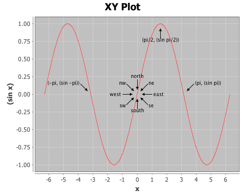
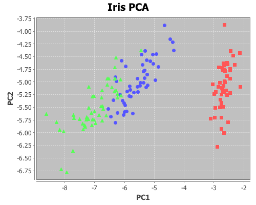
This next example will demonstrate using the add-text and add-polygon functions by annotating the iris PCA scatter-plot generated in an earlier post. The code for creating this plot can be found here.

Now add the species names to each cluster.

(doto plot
  (add-text -2.5 -6.5 "Setosa")
  (add-text -5 -5.5 "Versicolor") 
  (add-text -8 -5.5 "Virginica"))

The text is centered at the given coordinates. Finally place a box around the Setosa group.

(add-polygon plot 
  [[-3.2 -6.3] [-2 -6.3] [-2 -3.78] [-3.2 -3.78]])

Shapes are not limited to rectangles, add as many coordinates as necessary to create arbitrary polygons; the last point will automatically connect to the first one. If only two coordinates are provided a single line is added to the plot.

Incanter charts are instances of the JFreeChart class from the JFreeChart library, so additional customizations can be achieved by using the underlying Java APIs directly.

The complete code for this example can be found here.

Fitting non-linear models

This example will demonstrate how to fit a non-linear least-squares model in Incanter using the non-linear-model function.

This example will use a data set from NIST, which are the result of a NIST study involving ultrasonic calibration. The response variable is ultrasonic response, and the predictor variable is metal distance.

You will need the incanter.core, incanter.optimize, incanter.charts, and incanter.datasets libraries.

Load the necessary Incanter libraries.

(use '(incanter core optimize charts datasets))

For more information on using these packages, see the matrices, datasets, and sample plots pages on the Incanter wiki.

Now load the NIST data set called Chwirut, (you can find more information on this data set at http://www.itl.nist.gov/div898/strd/nls/data/chwirut1.shtml)

(def data (to-matrix (get-dataset :chwirut)))
(def x (sel data :cols 1))
(def y (sel data :cols 0))

Now view the data

(def plot (scatter-plot x y :legend true))
(view plot)

Clearly, x and y do not have a linear relationship, so we will try the exponential model used by NIST,

y = exp(-b1*x)/(b2+b3*x) + e

Here’s a Clojure function that implements this model

(defn f [theta x]
  (let [[b1 b2 b3] theta]
    (div (exp (mult (minus b1) x)) (plus b2 (mult b3 x)))))

This function will be passed to the non-linear-model function, and will need to take a vector of parameters, theta, and a value (or vector of values) of x as arguments, and return one or more values of y.

The non-linear-model function uses either the Gauss-Newton (default) or Newton Raphson (available using the :method option) algorithms to estimate the values of theta that minimizes the residual sum of squares. Both algorithms require starting values for the parameters. Finding these values is a bit of a black art, and may require plotting different values. In this case we will start by plotting some start values, provided by NIST, on the scatter plot of the data.

(def start1 [0.1 0.01 0.02])
(add-lines plot x (f start1 x))

These values, provide a generally correct shape for the model function, so we will use them as the start values in the non-linear-model function, using the default Gauss-Newton algorithm.

(def nlm1 (non-linear-model f y x start1))

And then plot the fitted values on the scatter-plot

(add-lines plot x (:fitted nlm1))

The fit looks pretty good. Interestingly, these start values failed to converge to the correct solution when the optional Newton-Raphson algorithm was used. The Newton-Raphson algorithm performed correctly with a second set of start values that were closer to the final estimates.

The complete code for this example can be found here.

Further Reading

Linear regression with higher-order terms

This example will use a data set from NIST. It doesn’t represent the typical data used in regression, but it will provide an opportunity to perform regression with higher-order terms using Incanter.

You will need the incanter.core, incanter.stats, incanter.charts, and incanter.datasets libraries.

Load the necessary Incanter libraries.

(use '(incanter core stats charts datasets))

For more information on using these packages, see the matrices, datasets, and sample plots pages on the Incanter wiki.

Now load the NIST data set called filip, (you can find more information on this data set at http://www.itl.nist.gov/div898/strd/lls/data/Filip.shtml)

(def data (to-matrix (get-dataset :filip)))

Extract the y values,

(def y (sel data :cols 0))

and then use the sweep function to center the x values, in order to reduce collinearity among the polynomial terms

(def x (sweep (sel data :cols 1)))

Now take a look at the data:

(def plot (scatter-plot x y))
(view plot)

As you can see, this isn’t a typical data set, so we will use the same atypical model as NIST to fit the data:

y = b0 + b1*x + b2*x^2 + b3*x^3 + ... + b10*x^10

The following line of code creates a matrix of the polynomial terms x, x^2, x^3, x^4, x^5, x^6, x^7, x^8, x^9, x^10,

(def X (reduce bind-columns (for [i (range 1 11)] (pow x i))))

Run the regression, and view the results.

(def lm (linear-model y X))

Start with the overall model fit:

(:f-stat lm) ;; 2162.439
(:f-prob lm) ;; 1.1E-16

The model fits, now check out the R-square:

(:r-square lm) ;; 0.997

The model explains over 99% of the variance in the data. Like I said, not a typical data set.

View the estimates of the coefficients, and the p-values of their t-tests

(:coefs lm)
(:t-probs lm)

The values for coefficients b0, … b10 are (0.878 0.065 -0.066 -0.016 0.037 0.003 -0.009 -2.8273E-4 9.895E-4 1.050E-5 -4.029E-5), and the p-values are (0 0 0 1.28E-5 0 0.083 1.35E-12 0.379 3.74E-8 0.614 2.651E-5).

All the coefficients are significant except b5, b7, and b9.

Finally, overlay the fitted values on the original scatter-plot

(add-lines plot x (:fitted lm))

That’s the kind of fit rarely seen on real data! In fact, on real data this would be an example of over-fitting. This model likely wouldn’t generalize to new data from the same process that created this sample.

The complete code for this example is here.

Further Reading

Student’s t-test

This example will demonstrate the t-test function for comparing the means of two samples. You will need the incanter.core, incanter.stats, incanter.charts, and incanter.datasets libraries.

Load the necessary Incanter libraries.

(use '(incanter core stats charts datasets))

For more information on using these packages, see the matrices, datasets, and sample plots pages on the Incanter wiki.

Now load the plant-growth sample data set.

(def plant-growth (to-matrix (get-dataset :plant-growth)))

Break the first column of the data into three groups based on the treatment group variable (second column) using the group-by function,

(def groups (group-by plant-growth 1 :cols 0))

and print the means of the groups

(map mean groups) ;; returns (5.032 4.661 5.526)

View box-plots of the three groups.

(doto (box-plot (first groups))
      (add-box-plot (second groups))
      (add-box-plot (last groups))
      view)

This plot can also be achieved using the :group-by option of the box-plot function.

(view (box-plot (sel plant-growth :cols 0) 
                :group-by (sel plant-growth :cols 1)))

Create a vector of t-test results comparing the groups,

(def t-tests [(t-test (second groups) :y (first groups))
              (t-test (last groups) :y (first groups))
              (t-test (second groups) :y (last groups))])

Print the p-values of the three groups,

(map :p-value t-tests) ;; returns (0.250 0.048 0.009)

Based on these results the third group (treatment 2) is statistically significantly different from both the first group (control) and the second group (treatment 1). However, treatment 1 is not statistically significantly different than the control group.

The complete code for this example can be found here.

Further Reading

Correlation and permutation tests

Permutation tests can be used with many different statistics, including correlation.

For this example, you will need the incanter.core, incanter.stats, incanter.charts, and incanter.datasets libraries. The incanter.datasets library contains sample data sets.

Load the necessary Incanter libraries.

(use '(incanter core stats charts datasets))

For more information on using these packages, see the matrices, datasets, and sample plots pages on the Incanter wiki.

Load the us-arrests data set:

(def data (to-matrix (get-dataset :us-arrests)))

Now extract the assault and urban population columns:

(def assault (sel data :cols 2))
(def urban-pop (sel data :cols 3))

Calculate the correlation between assaults and urban-pop:

(correlation assault urban-pop)

The sample correlation is 0.259, but is this value statistically significantly different from zero? To answer that, we will perform a permutation test by creating 5000 permuted samples of the two variables and then calculate the correlation between them for each sample. These 5000 values represent the distribution of correlations when the null hypothesis is true (i.e. the two variables are not correlated). We can then compare the original sample correlation with this distribution to determine if the value is too extreme to be explained by null hypothesis.

Start by generating 5000 samples of permuted values for each variable:

(def permuted-assault (sample-permutations 5000 assault))
(def permuted-urban-pop (sample-permutations 5000 urban-pop))

Now calculate the correlation between the two variables in each sample:

(def permuted-corrs (map correlation 
                         permuted-assault 
                         permuted-urban-pop))

View a histogram of the correlations

(view (histogram permuted-corrs))

And check out the mean, standard deviation, and a 95% interval for the null distribution:

(mean permuted-corrs)

The mean is near zero, -0.001,

(sd permuted-corrs)

the standard deviation is 0.14,

(quantile permuted-corrs :probs [0.025 0.975])

and the values returned by the quantile function are (-0.278 0.289), which means the original sample correlation of 0.259 is within the 95% interval of the null distribution, so the correlation is not statistically significant at an alpha level of 0.05.

The complete code for this example is found here.

Further Reading

Principal components analysis

Principal components analysis (PCA) is often used to reduce the number of variables, or dimensions, in a data set in order to simplify analysis or aid in visualization. The following is an example of using it to visualize Fisher’s five-dimensional iris data on a two-dimensional scatter plot, revealing patterns that would be difficult to detect otherwise.

First, principal components will be extracted from the four continuous variables (sepal-width, sepal-length, petal-width, and petal-length); next, these variables will be projected onto the subspace formed by the first two components extracted; and then this two-dimensional data will be shown on a scatter-plot. The fifth dimension (species) will be represented by the color of the points on the scatter-plot.

For this example, you will need the incanter.core, incanter.stats, incanter.charts, and incanter.datasets libraries. The incanter.datasets library contains sample data sets.

Load the necessary Incanter libraries.

(use '(incanter core stats charts datasets))

For more information on using these packages see the matrices, datasets, and sample plots pages on the Incanter wiki.

Next, load the iris dataset and view it.

(def iris (to-matrix (get-dataset :iris)))
(view iris)

Then, extract the columns to use in the PCA,

(def X (sel iris :cols (range 4)))

and extract the “species” column for identifying the group.

(def species (sel iris :cols 4))

Run the PCA on the first four columns only

(def pca (principal-components X))

Extract the first two principal components

(def components (:rotation pca))
(def pc1 (sel components :cols 0))
(def pc2 (sel components :cols 1))

Project the four dimension of the iris data onto the first two principal components

(def x1 (mmult X pc1)) 
(def x2 (mmult X pc2))

Now plot the transformed data, coloring each species a different color

(view (scatter-plot x1 x2 
                    :group-by species
                    :x-label "PC1" 
                    :y-label "PC2" 
                    :title "Iris PCA"))


The complete code for this example can be found here.

Further Reading

Introduction to Incanter

This blog will focus on statistical programming in the Clojure language using Incanter.

Incanter is a Clojure-based, R-like statistical computing and graphics environment for the JVM. At the core of Incanter are the Parallel Colt numerics library, a multithreaded version of Colt, and the JFreeChart charting library, as well as several other Java and Clojure libraries.

The motivation for creating Incanter is to provide a JVM-based statistical computing and graphics platform with R-like semantics and interactive-programming environment. Running on the JVM provides access to the large number of existing Java libraries for data access, data processing, and presentation. Clojure’s seamless integration with Java makes leveraging these libraries much simpler than is possible in R, and Incanter’s R-like semantics makes statistical programming much simpler than is possible in pure Java.

Motivation for a Lisp-based R-like statistical environment can be found in the paper Back to the Future: Lisp as a Base for a Statistical Computing System by Ihaka and Lang (2008). Incanter is also inspired by the now dormant Lisp-Stat (see the special volume in the Journal of Statistical Software on Lisp-Stat: Past, Present, and Future from 2005).

Motivation for a JVM-based Lisp can be found at the Clojure website, and screencasts of several excellent Clojure talks by the language’s creator, Rich Hickey, can be found at clojure.blip.tv.

Visit the Github source repository to download the Incanter library and source code, and for information on getting started with Clojure and Incanter, visit the getting started page on the Incanter wiki; for plotting examples, see the sample plots page; for examples of probability and statistical functions, see the probability distributions and statistics examples pages; for examples of matrix operations, see the matrices page; for examples of data I/O functions, see the datasets page; and for descriptions of all of Incanter’s functions, see the API page.